Thursday, 13 March 2014

Clock Drawings; Fine line pen

Time is an interesting concept; ways of measuring time have been a vital part of human life and we are surrounded by clocks in the twenty first century. An exhibition called Potts clocks looks at all the main clocks in the centre of leeds made by Mr Potts. They all have a distinctive design in the centre of the clock. Five Rhombuses that are rotated three hundred and sixty Degrees round a point creates the individuals signature design.

This week I took my sketchbook into town and recorded four of the clocks that Mr. Potts made. The clock face is quite simple, so the buildings are the variable in how much detail is around the clock and the clock handles. The drawings were recorded in the rain which slightly distorted the image, I used a thin black marker pen to get a graphic style influenced by Hennie Haworth and Rob Lowe.


Generate Collision

Heimtextil brought together four trends for 2013, generate collision, exalt purity, progress and revive and engineer nature. This project will be focusing on the trend entitled 'Generate Collision'. It is exciting to bring different elements together and see how they blend.

To create an appealing but contrasting design is a challenge, it is exciting due to the fact that the outcomes cannot always be controlled.

Looking at the first word; 'Generate' means to create something that is man made or by nature. I think it would be interesting to combine the two. The second word, 'Collision', includes a variety of exciting options to explore. In this project the elements I wish to contrast are shapes, patterns and colour whilst sticking to the current market trends.

Recording what we see and observe from the objects in front of us helps to look at specific details. When looking at an object or person, line, tone and the environmental surroundings are important factors. How it interacts with that space and colours around it.


Monday, 17 February 2014

Links to my other websites

Beth Murray's;

Tumblr - http://bethmurraytextiledesign.tumblr.com/

Photography portfolio - http://bethmurray.wix.com/photography

Flickr - http://www.flickr.com/photos/bethmurray/

Pinterest - http://www.pinterest.com/bethnm/

LinkedIn - http://www.linkedin.com/pub/beth-murray/48/84a/889


Saturday, 18 January 2014

Road trip USA; Summer 2013

My route through America after working at a summer camp.....

Beginning:  Camp starlight, Pennsylvania.
On days off we went to Binghamton, Cole park, Ithaca, Skinners Falls, Wilkes Barre and Hancock.

After camp:
New York City
Sidney, Ohio
Flint, Michigan
Chicago, Illinois
Kentucky
Nashville, Tenesse
Atlanta, Georgia
Myrtle Beach, South Carolina
Charlotte, North Carolina
Washington D.C.
West Virginia
Columbus, Ohio
Lafayette, Indiana

End: New York, JFK Airport....... Back home to London.

To remember all the places I went and all the friends I stayed with, I stitched this route into a paper map. Need to find a frame and hang it on my wall! In total I was in America for three months and it was easily one of the best summers of my life. I also collected T-shirts from most the places I went, next project when I get a break from uni work - Make the T-shirts into a blanket.


Sunday, 29 December 2013

Marbling in Repeat


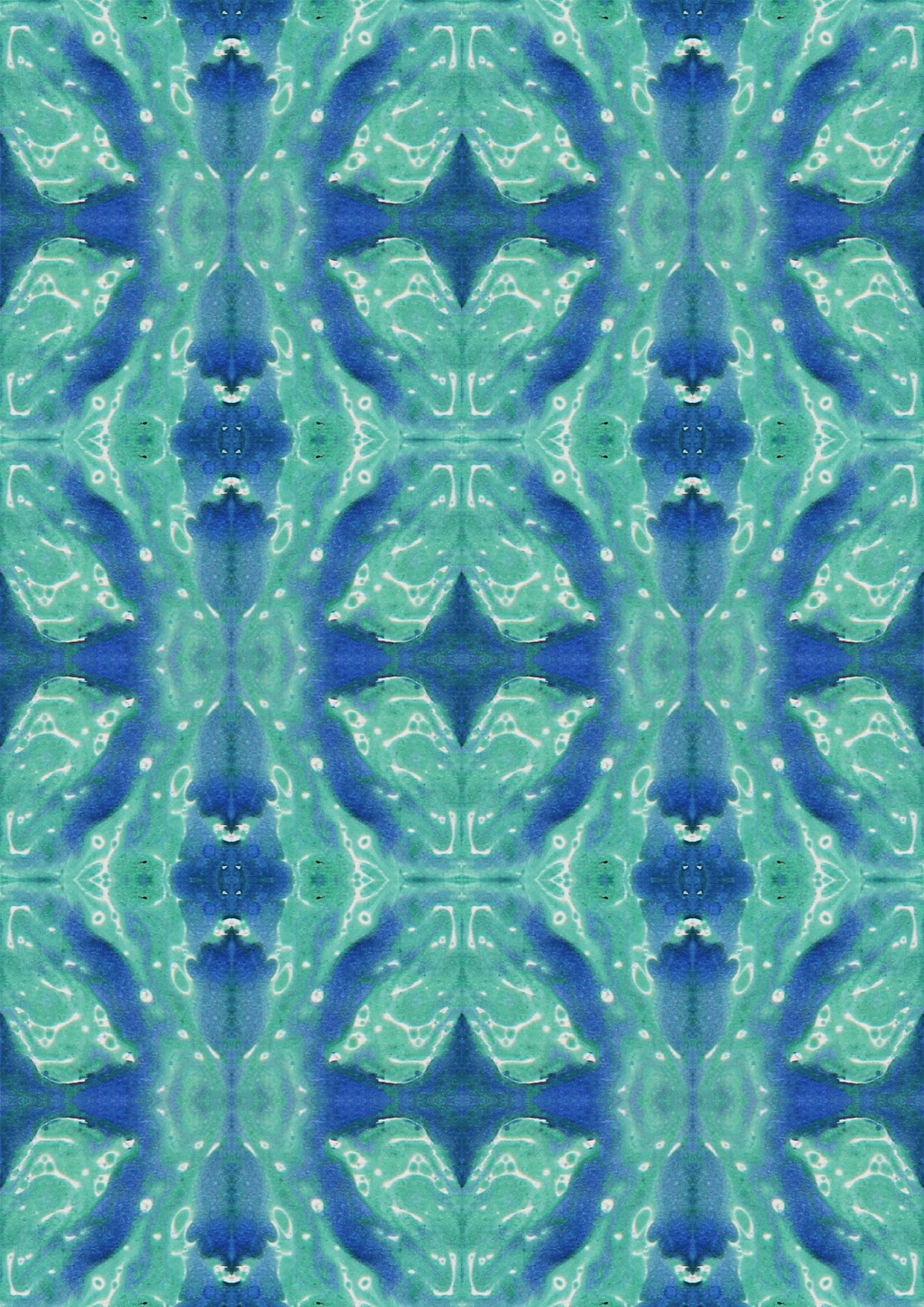
Marbling. A well practiced art of mixing oil paint in water and turpentine that creates a a water-like effect. I only used blue and green paint so I didn't end up with a muddy brown from mixing too many colours. The textures on the papers are very appealing and the colours are soft but vary enough to make contrasts between light and dark. 

Inspired by Lauren Clark's work, I took my work and manipulated, repeated and distorted it in Photoshop. Her designs can be seen in a book that was published, entitled 'Marbleized Paper Patterns'.


Original marbled paper;


Images in repeat;